
Shifto:
A Visual Identity Built With (Not Just For) Gen Z

Designing for young people means earning their attention without pretending to be one of them. For Shifto, the brand had to feel safe, useful, and natural in the digital spaces where mental health conversations already happen.

Shifto goals

New Era

Brief
& goals

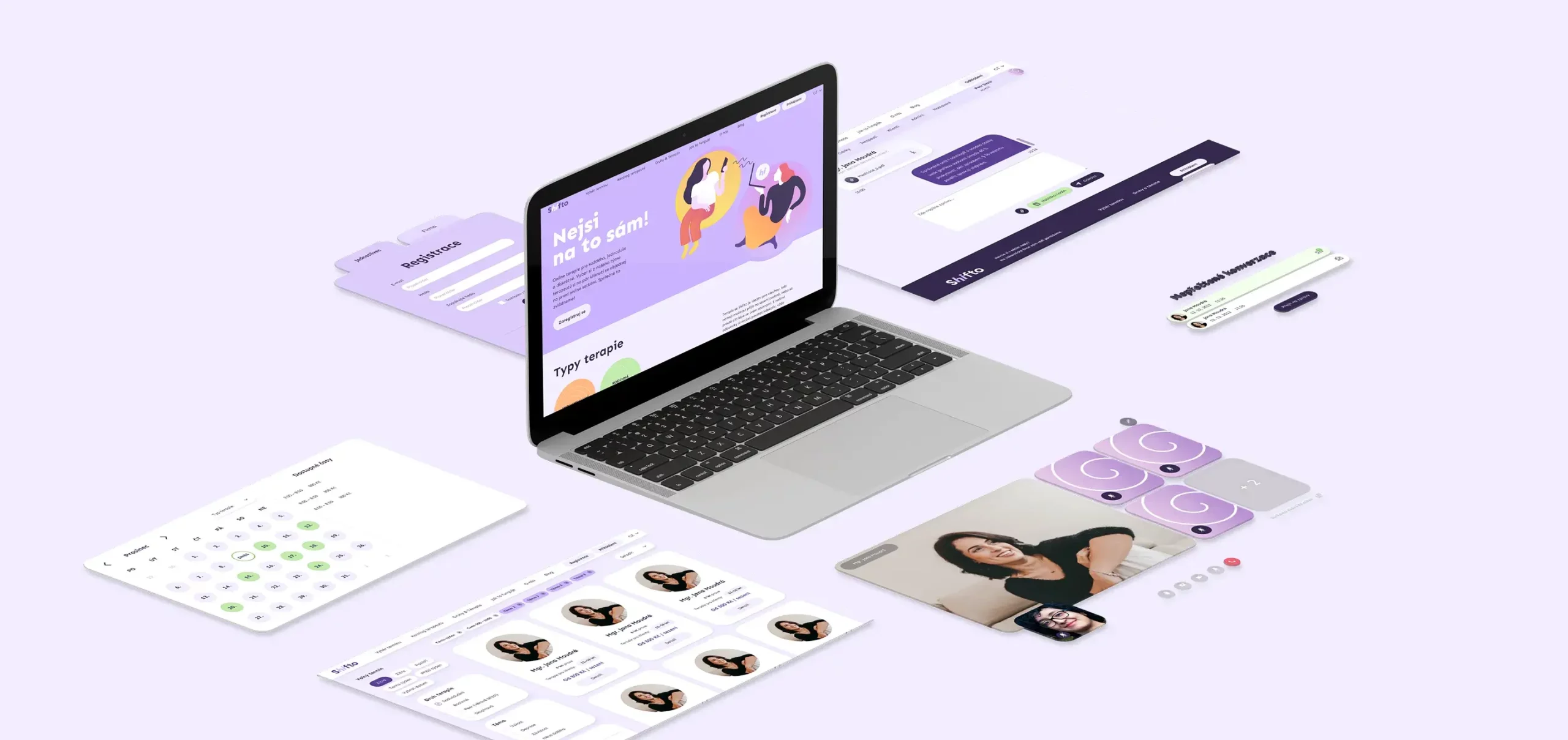
Shifto was a new platform offering online therapy with a focus on kids, teens, and young adults, plus education and prevention content in mental health. Our job: define the brand, build a visual identity that feels safe and modern, and create communication that works in real digital life.

Our Approach

FINDING THE VOICE

Design That Meets Gen Z Where They Are

Shifto Illustration

Step 1

Visual
Identity

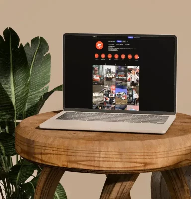
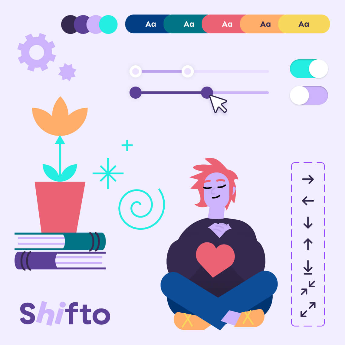
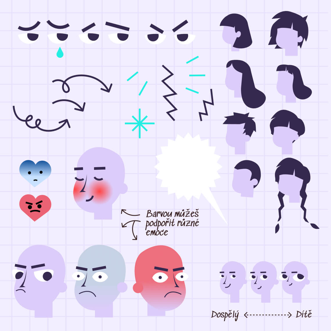
Logo, colour system, type, UI components, illustration/photography style, and accessible layouts tuned for mobile use.

Shifto Illustration

Step 2

Voice & content
guides

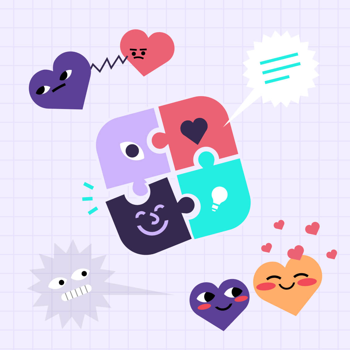
Pain and authentic-feeling language, supportive tone, content warnings where appropriate, and structure that respects attention spans.

Shifto illustration

Step 3

“New to the list”
→ Welcome series

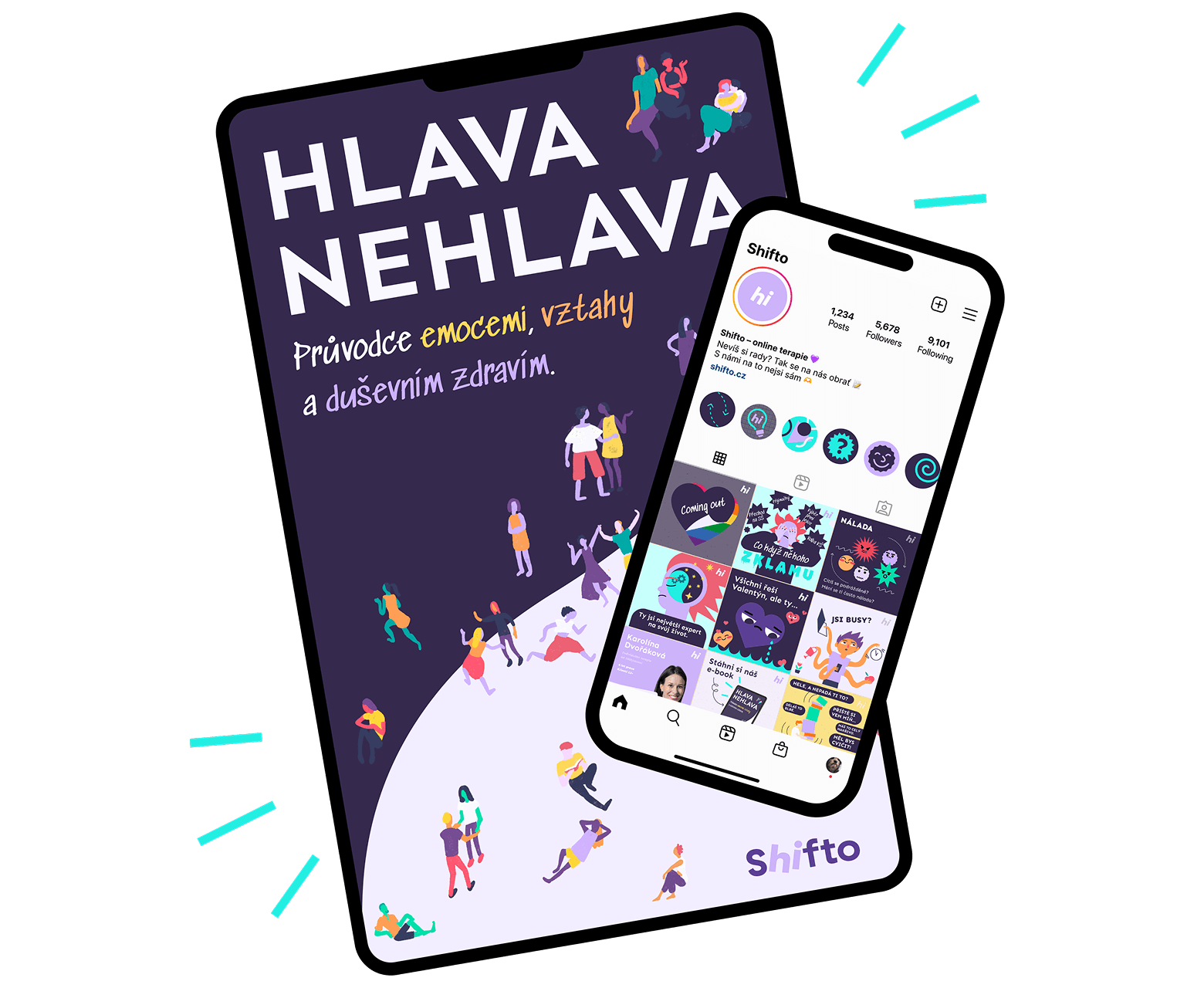
Website foundations, social profiles and templates, therapist video profiles, and a mental-health ebook built for a young, digital audience (short chapters, scannable tips, and peer-friendly language).

Shifto playbook

Step 4

Playbook
for creators

“Practical rules on imagery, caption lengths, do/don’t phrasing, and how to adapt content for sensitive topics.”

A HANDY COMPANION

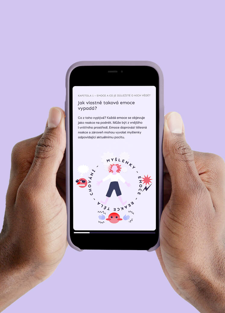
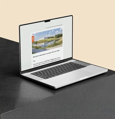
We created a sleek ebook about mental wellbeing: understanding your emotions, routines for mental hygiene, when and how to ask for help. No preaching — just helpful tips in a Gen Z-friendly language in a format that’s always at hand on your smartphone.
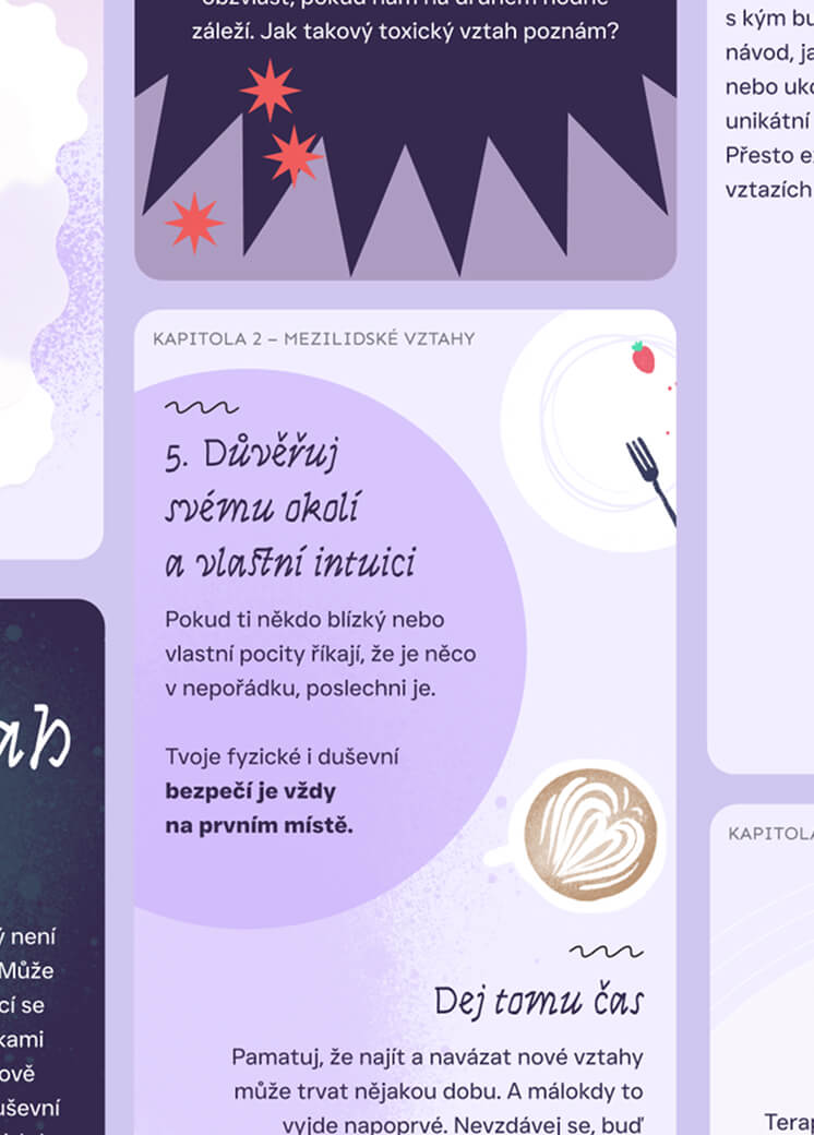
Shifto ebook
Shifto mockup
Gen Z

THE IMPACT

Why It CONNECTED

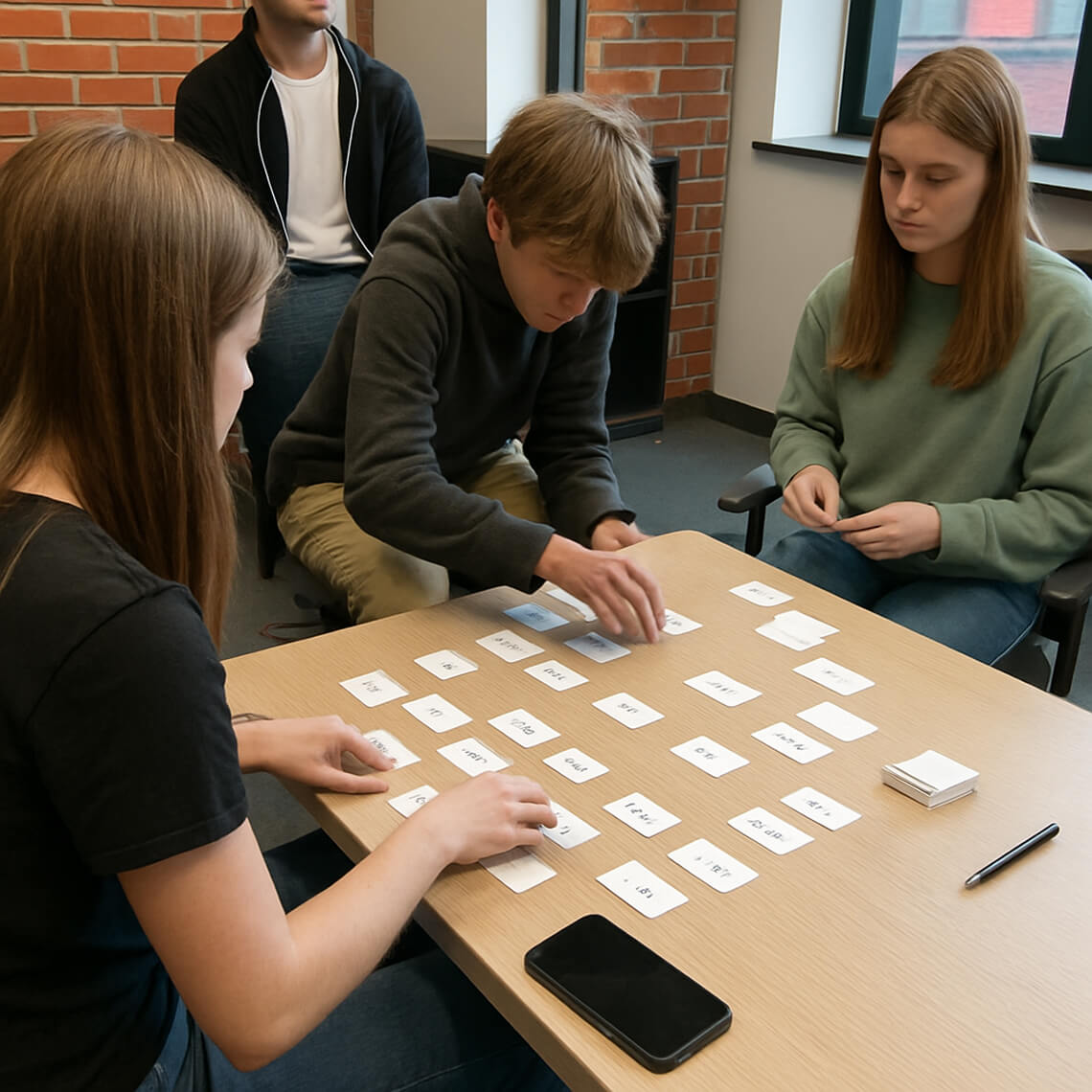
We tested in the real world, not just internally. The Gen Z work group gave fast, honest feedback; we iterated designs and copy to reduce friction (less clinical, more kind; fewer walls of text, more “what to do next”). Creative choices were guided by evidence: readability scores, tap/scroll behavior, and workshop notes, not guesswork.

OUR TAKEAWAY

What WORKED

icon

A trustworthy, calm identity that feels human (not medical) and fits TikTok/Instagram/YouTube as well as the site.

icon

Fewer barriers to engagement
(clear language, shorter formats, safety cues).

icon

Ready-to-use content systems
(for social, site, and the ebook) that Shifto’s team can scale without losing the tone.
icon

A stronger bridge to parents: parallel messaging that informs without speaking over young users or disrespecting the way they see things.

Our Takeaway

“Design follows evidence. When you co-create with the audience, bring mental-health literacy to the table, and ship content in the formats they already use, you get a brand that feels safe, looks modern, and actually gets read.”

Icon Love It

Contact Us

LET’S DO SOMETHING BIG TOGETHER

New projects, old projects, careers, press and other inquiries — reach out to us with anything.
Thank you